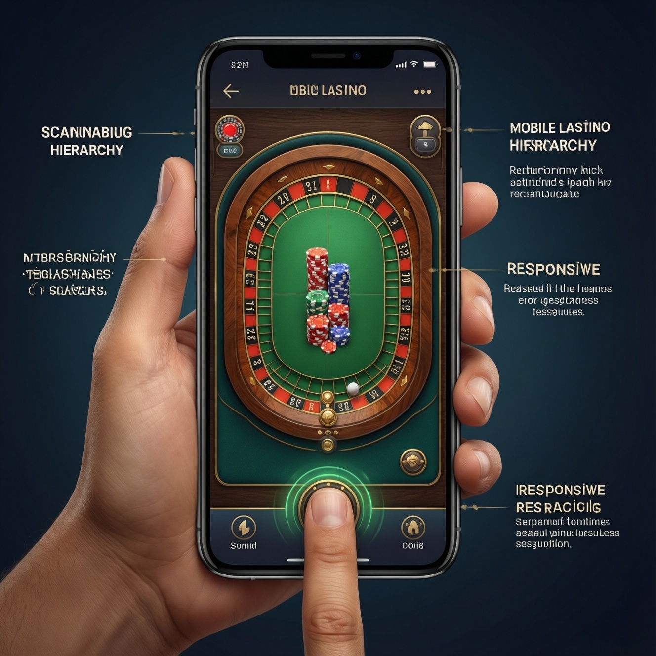
A truly one-hand-friendly mobile casino UX lets players browse games, deposit, and play core actions using a single thumb without stretching, mis-taps, or hidden controls. It relies on thumb-reach placement, simplified navigation, gesture support with clear feedback, scannable visual hierarchy, and performance discipline so the app stays responsive on typical Thai mobile networks.
One‑Hand Usability at a Glance
- Keep primary actions inside a comfortable thumb zone; avoid top-corner critical buttons.
- Use one persistent navigation pattern; reduce decision points to a few clear routes.
- Support swipe-based browsing with obvious affordances and safe undo for risky actions.
- Design for fast scanning: clear jackpots/limits, readable odds, and predictable CTAs.
- Optimize perceived speed: progressive loading, lightweight animations, and stable layouts.
- Respect handedness and accessibility: mirror layouts where possible and expose system controls.
Thumb Reach and Interaction Zones
Principle: Put high-frequency actions where a thumb naturally rests. Rationale: Most one-handed usage happens while commuting or multitasking; forced stretching increases errors and drop-offs.
Best fit: A one hand casino app concept works well for quick sessions: browsing lobbies, tapping "Play", checking balance, and simple deposits/withdrawals.
When not to force it: Don't over-optimize for one-hand use if your app requires long-form verification flows, complex responsible gaming setup, or dense tables where precision taps are essential. In those areas, prioritize clarity and safety over compactness, and allow two-hand interaction comfortably.
- Design assumption: users may switch grips; don't lock critical controls to a single corner.
- Safety note: keep high-risk actions (large deposits, irreversible confirmations) deliberately slower, even if one-hand friendly.
Streamlined Navigation and Menu Patterns
Principle: Reduce navigation depth and make "where am I" obvious. Rationale: One-hand usage amplifies navigation fatigue; extra taps feel heavier and increase accidental exits.
What you'll need (requirements and access):
- Analytics events and funnels for lobby browsing, search, deposit start/complete, game launch, session resume, and error states.
- Clickable prototype tool (any) to test bottom nav, drawers, and modal patterns before engineering.
- Device coverage: at least one small phone, one large phone, and one mid-range Android common in Thailand for real performance checks.
- Design system basics: button sizes, spacing scale, typography, and component states for mobile casino app UI.
- Content and compliance inputs: responsible gaming text, KYC steps, and payment method labels to avoid rework.
Navigation patterns that stay one-hand friendly:
- Bottom navigation (3-5 items): Lobby, Search, Promotions, Wallet, Profile.
- Contextual sub-nav inside Lobby: Chips/tabs for Slots, Live, Table, Favorites.
- Sticky "Resume game" chip near the bottom after returning from a game.
- Wallet shortcut visible from most screens; keep deposit and withdrawal one level away.
Success criteria to target: fewer taps to reach a game and wallet actions, fewer backtracks, and fewer rage taps (rapid repeated taps on the same element). Validate with task-based tests and event drop-off monitoring.
Gesture Controls and Haptic Feedback
Principle: Gestures should replace repetitive tapping, not add hidden complexity. Rationale: Swipes and pulls work naturally one-handed, but only if the app clearly communicates what will happen and prevents accidental commits.
-
Map your one-hand "core loop" tasks to 5-7 actions.
List the must-do tasks that define the best mobile casino app experience: find a game, filter, open, adjust stake, view rules, deposit, and return to lobby.
- Testing method: run moderated tasks with users holding the phone in one hand; record mis-taps and pauses.
- Measurable check: each task should have a single obvious next action, with minimal backtracking.
-
Introduce "safe gestures" first (browse, dismiss, refresh).
Use swipe to browse carousels and lists, swipe down to refresh balances, and swipe to dismiss non-critical panels. Avoid gesture-only access to money actions.
- Microcopy pattern: "Pull to refresh balance" shown once, then rely on subtle hinting.
- Safety: never make "Swipe to confirm deposit" the default; keep explicit buttons.
-
Add haptics only for meaningful moments (not every tap).
Use a light tap for successful actions (e.g., added to Favorites) and a distinct pattern for errors (e.g., insufficient balance). Keep it consistent across the app.
- Accessibility: provide a setting to reduce or disable haptics; respect OS-level preferences.
- Measurable check: fewer repeated taps on confirmation buttons after adding haptics.
-
Prevent accidental triggers with thresholds and undo.
For swipe actions like "Remove favorite" or "Hide promo," require a clear swipe distance and show an undo toast near the bottom within thumb reach.
- Microcopy pattern: "Removed from Favorites - Undo".
- Testing method: stress-test on public transport scenarios (standing, one-handed) to catch false positives.
-
Make gestures discoverable with visible affordances.
Use handles, partial peeks, or directional icons so users can infer swipes. If a gesture is optional, keep a button alternative in the same screen.
- Measurable check: track gesture usage vs. button usage; if gestures stay unused, improve cues or remove the gesture.
Fast mode (3-5 steps)
- Move primary CTAs (Play, Deposit, Confirm) into the bottom thumb zone and keep them consistent across screens.
- Standardize on bottom navigation + simple lobby tabs; cap depth so key tasks are never buried.
- Enable safe swipes (browse, dismiss, refresh), add undo for destructive gestures, and keep money actions explicit.
- Audit hierarchy and performance on a mid-range Android device; fix layout shifts and heavy animations first.
Visual Hierarchy for Quick Scanning
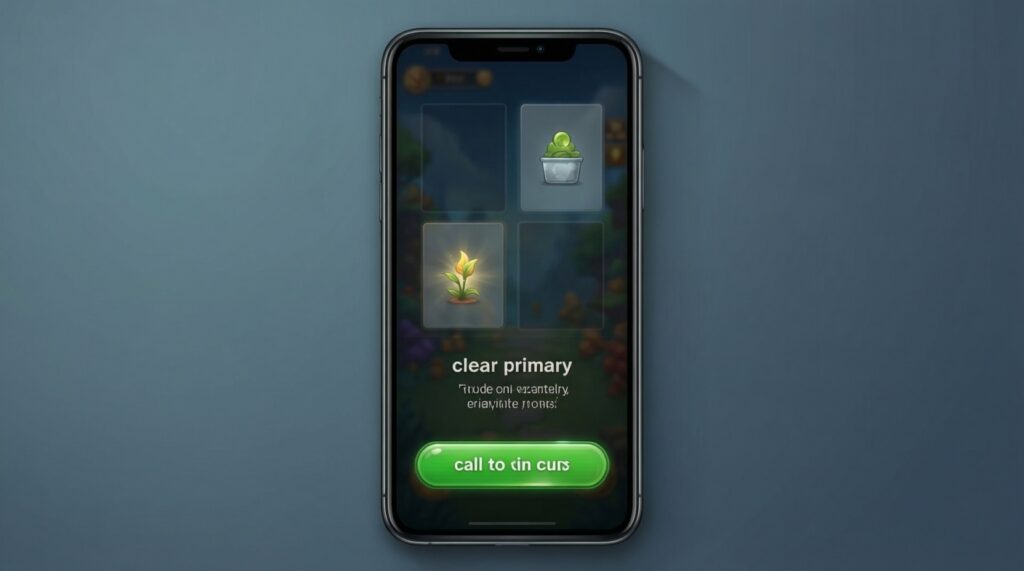
Principle: Make the next action obvious within one glance. Rationale: One-hand use often means short attention windows; scanning beats reading.
- Primary CTA appears once per screen and sits near the bottom (no competing twin CTAs).
- Game tiles show only what matters: name, provider (optional), key badge (New/Hot), and one clear "Play".
- Promotions have a clear benefit line and a single action; avoid long paragraphs above the fold.
- Wallet shows balance, deposit, and withdrawal as top actions; "History" is secondary.
- Typography supports fast reading: stable sizes, sufficient contrast, and predictable line lengths.
- States are unmistakable: loading, empty, error, and success messages are visually distinct.
- Touch targets are roomy enough to avoid mis-taps when holding the phone in one hand.
- No critical information is only in a top bar (limits, bet amount, session status remain visible near interaction).
Recommended testing: five-minute hallway tests with timed tasks (find a game, deposit, return to lobby). Pair with screen recordings to identify hesitation points and mis-taps.
Performance, Load Time and Battery Impact
Principle: Speed is a usability feature. Rationale: If the UI stutters, one-hand interactions become error-prone and feel unsafe around wallet actions.
- Heavy lobby carousels that block first interaction; load core content first, decorate later.
- Layout shifts when banners or images load; reserve space to keep taps from landing on the wrong control.
- Over-animated transitions that delay navigation and drain battery; keep animations purposeful and short.
- Uncached thumbnails causing repeated downloads; cache responsibly and reuse assets.
- Wallet refresh loops that spam network calls; rate-limit and provide manual pull-to-refresh.
- WebView-heavy screens for critical flows (deposit/KYC) that feel inconsistent; use native components where reliability matters.
- Too many trackers increasing startup time; audit SDK impact and defer non-essential initialization.
- Large images and video promos on mobile data; provide static fallback and respect data saver modes.
Measurable checks: ensure users can interact quickly after launch, scrolling stays smooth, and the device doesn't heat noticeably during normal browsing. Validate on real networks and mid-range devices common in Thailand.
Accessibility and Handedness Considerations
Principle: One-hand friendly should also be inclusive. Rationale: Users differ in hand size, dominant hand, and assistive settings; a single rigid layout will exclude part of your audience.
- Left-hand mode / mirroring: mirror bottom navigation emphasis and key actions for left-handed users where feasible.
- Reachability alternatives: provide a floating "Back" affordance near the bottom on long pages, while still respecting OS back gestures.
- Text size and contrast support: ensure the UI remains usable with larger text settings and high-contrast modes without overlapping CTAs.
- Low-precision mode for complex controls: for bet sliders or quick picks, provide stepper buttons and presets (e.g., +/−, x2) that are easier one-handed.
Practical note for acquisition flows: If you handle online casino app download guidance, keep post-install onboarding short and resumable; avoid forcing long forms in one session.
Practical Concerns, Quick Answers and Fixes
How do I know if my lobby is actually one-hand friendly?

Run a timed test: ask users to find a specific game and start it using one hand. If they frequently re-grip, miss buttons, or hesitate at navigation choices, your thumb-zone placement and hierarchy need adjustment.
Should deposit and withdrawal be reachable in one tap from everywhere?
They should be consistently easy to find, but not overly trigger-happy. Keep a wallet shortcut visible, and require clear confirmation steps for money actions to prevent accidental taps.
Are gesture-only controls acceptable in casino app UX design?
Use gestures as shortcuts, not as the only path. Always provide a visible button alternative for core actions so users aren't forced to discover hidden interactions.
What's the safest way to add haptics without annoying users?
Reserve haptics for confirmations and errors, not every tap. Respect system settings and offer an in-app toggle if your audience expects control.
How can I reduce mis-taps on large-screen phones?
Move primary CTAs to the bottom zone, increase spacing between destructive and safe actions, and stabilize layouts to avoid shifting elements during load. Validate by replaying session recordings and counting repeated taps.
What makes a casino app feel like the best mobile casino app for quick sessions?
Predictable navigation, fast loading, and a clear next action on every screen. Users should be able to resume a game and manage balance without hunting through menus.
How do I keep the mobile casino app UI consistent across games and the wallet?
Standardize typography, button styles, and message patterns across native screens and embedded game surfaces. Use a shared component library and enforce states (loading, error, empty) consistently.