
In 2026, mobile casino UX that actually moves conversions and retention on iOS and Android comes down to three things: low-friction onboarding, fast and stable gameplay on small screens, and trust cues inside payments/KYC. Build for one-thumb use, explicit security feedback, and platform-specific patterns so users can deposit, verify, and play without confusion or accidental taps.
Essential UX priorities for mobile casinos
- Reduce account creation to a single primary path; defer optional fields with progressive profiling.
- Make performance visible: fast first meaningful paint and clear loading states for games and wallet actions.
- Design for touch-first safety: large tap targets, guarded destructive actions, and error-proofed numeric inputs.
- Communicate trust continuously: clear KYC status, payment confirmation microcopy, and consistent security indicators.
- Adapt to iOS vs Android conventions for navigation, permissions, autofill, and biometric prompts.
- Measure every critical funnel step with success rate, time-to-complete, and drop-off by device/OS.
Streamlined onboarding and frictionless account flows for touch
Best fit: Use this approach when you operate or benchmark against best mobile casino apps and need higher deposit completion and faster "first bet" moments on mobile.
When not to do it: Avoid ultra-short onboarding if your compliance model requires up-front identity verification before any gameplay or wallet access, or if your fraud risk cannot be managed with staged limits and step-up verification.
- Acceptance criteria (onboarding): users can create an account with one primary CTA per screen; optional info is clearly optional; errors are specific and fixable without losing progress.
- Acceptance criteria (touch): key CTAs are reachable with one thumb; tap targets are comfortably large; numeric inputs use the correct keypad; no accidental navigation wipes typed data.
- iOS vs Android note: align with OS autofill and password managers; avoid custom "fake" input fields that break autofill and accessibility APIs.
Game layout, latency budgets and visual hierarchy for small screens
To deliver a "feels instant" experience for a mobile casino 2026 audience, you need both UX design assets and engineering observability that ties UI states to real device performance.
- Device lab coverage: at least one lower-memory Android device, one mid-tier Android, and one current iPhone; include both Wi‑Fi and cellular network testing.
- Design requirements: responsive layout rules for portrait/landscape; safe areas/notches; scalable typography; component states for loading, offline, degraded mode, and retry.
- Performance tooling access: crash reporting, performance traces, network inspection, and app analytics with funnel events for game launch and first interaction.
- Latency budget definition: decide pass/fail thresholds for (a) game catalog scrolling, (b) game launch, (c) wallet refresh, (d) deposit confirmation UI feedback.
- Acceptance criteria (small screens): primary actions remain visible without scrolling; game tiles are readable; key metadata (provider, volatility/feature tags if used) never crowds the CTA.
Secure payments, KYC flows and micro-interactions that communicate trust
Preparation checklist (before you change flows):
- Map the end-to-end journey: deposit → pending → approved/failed → wallet updated; KYC → in review → approved/rejected.
- Inventory payment methods and failure reasons; ensure each has a user-facing, non-technical explanation and a next step.
- Define step-up rules (limits, velocity checks, risky device) so the UX can request additional verification without feeling arbitrary.
- Align copy and visuals with your "safe mobile casinos" positioning: consistent terminology for verification, encryption, and support escalation.
- Confirm OS-level requirements for biometrics and permissions; plan separate UI states for "not available", "not enrolled", and "temporarily locked".
-
Design a single Wallet hub with explicit statuses
Centralize balance, pending transactions, bonuses (if applicable), and verification status in one place so users don't hunt across tabs. Every status must have a plain-language explanation plus a single recommended next action.
- Acceptance criteria: "Pending", "Completed", and "Failed" states are visually distinct; tapping a transaction shows details and next steps without contacting support.
-
Implement guarded deposit flows with immediate feedback
After "Deposit", show instant UI acknowledgement before network completion, then keep users informed with a progress state and an idempotent retry option. Avoid duplicate charges by disabling repeated submissions and using clear "processing" states.
- Acceptance criteria: users cannot accidentally submit the same deposit twice; back navigation does not lose context; retries do not create a second transaction.
-
Make KYC a staged, explainable journey (not a surprise wall)
Use progressive disclosure: explain why verification is needed, what documents are accepted, and how long review states typically take in your operation (avoid promising times you can't guarantee). Show "what to do next" on every KYC state.
- Acceptance criteria: the KYC screen always shows current status; re-upload flows are clear; rejection includes fixable guidance (e.g., "photo blurry", "name mismatch").
-
Use platform-native biometrics for re-auth at high-risk moments
Prompt for Face ID/Touch ID on iOS and BiometricPrompt on Android during withdrawals, payment method changes, and sensitive profile edits. Provide a fallback that is secure and usable (PIN/passcode) without blocking legitimate users.
- iOS vs Android note: on iOS, respect system sheets and do not mimic biometric dialogs; on Android, handle device credential fallback consistently.
-
Write "trust microcopy" that reduces support tickets
Replace generic errors with reason + action: "Bank declined: try another card or contact your bank" is better than "Payment failed". Keep confirmations explicit (amount, method, fees if any, and what happens next).
- Acceptance criteria: error messages identify the field or cause; the user always has a next step; support entry points exist only after self-serve options.
-
Validate real-money compliance paths per OS storefront rules
If you operate a real money mobile casino iOS or real money mobile casino Android experience, ensure your distribution, age gating, and regulatory disclosures are surfaced where required, not hidden behind secondary screens.
- Acceptance criteria: required disclosures are reachable from onboarding and wallet; geo/age checks fail safely; blocked users get a clear explanation and support path.
Accessibility, input patterns and adaptive controls on iOS vs Android
- All tappable elements meet consistent minimum sizing, with enough spacing to prevent mis-taps on dense game grids.
- Text scales without breaking layouts; key CTAs remain visible at larger font sizes and in landscape.
- Screen reader labels exist for icons (deposit, withdraw, search, filters, close) and dynamic states (loading, error, success).
- Focus order is logical in modals and bottom sheets; closing a sheet returns focus to the triggering control.
- Numeric fields use the correct keypad; currency formatting is unambiguous; users can paste codes (OTP) reliably.
- Permissions are requested "just in time" with a prior explanation screen; denial states include the correct OS-specific remediation path.
- Biometric prompts follow native patterns (iOS system prompt; Android BiometricPrompt); fallback is always available and explained.
- Haptics/sound cues (if used) are not the only channel for success/error; there is always a visual confirmation.
Personalization, progressive profiling and retention nudges
- Asking for too much too early: long forms before first play increase abandonment; collect optional data after value is delivered.
- Over-personalizing the home screen: excessive carousels and "recommended for you" blocks bury search and categories.
- Confusing bonuses with cash: unclear wallet separation (cash vs bonus) erodes trust and triggers withdrawals disputes.
- Push notifications without user intent signals: sending promos before a user finishes KYC or makes a first deposit feels spammy.
- Ignoring "cold start" logic: new users get irrelevant recommendations instead of a guided "choose your game" entry.
- Hard-to-dismiss prompts: repeated rating popups or intrusive modals during gameplay cause churn.
- No cross-device continuity: users switching devices lose favorites, recent games, or verification progress.
- Segmenting by guesses, not behavior: personalization without measurable triggers (searches, recent plays, deposit attempts) becomes noise.
Pre-release checklist: metrics, test devices and regression scenarios
Use these alternatives when the full UX overhaul is not feasible before launch, or when you need controlled risk reduction.
- Progressive rollout with feature flags: ship new wallet/KYC UI to a small cohort first; expand only if conversion and error rates improve without rising support contacts.
- Wrapper-first optimization (WebView-heavy apps): if your app is mostly web content, focus on navigation, loading states, deep links, and login persistence before reworking every game screen.
- Payment-method prioritization: improve the top-used deposit methods and their failure handling first; leave edge methods unchanged until you have stable analytics on drop-offs.
- Device-tier targeting: if low-end Android performance is the main risk, ship lighter assets and simplified animations only to constrained devices while keeping richer UI on high-end phones.
Typical implementation hurdles and pragmatic remedies
Why do users drop during login even when the form is short?
Most drop-offs come from unclear error handling or broken autofill/password manager integration. Use native input fields, show field-level errors, and preserve typed data on back/foreground transitions.
What causes "duplicate deposit" complaints on mobile?
Repeated taps during slow network moments and missing idempotency on the backend are common. Disable the submit CTA after the first tap, show a "processing" state instantly, and make retries idempotent.
How do we reduce KYC abandonment without weakening compliance?
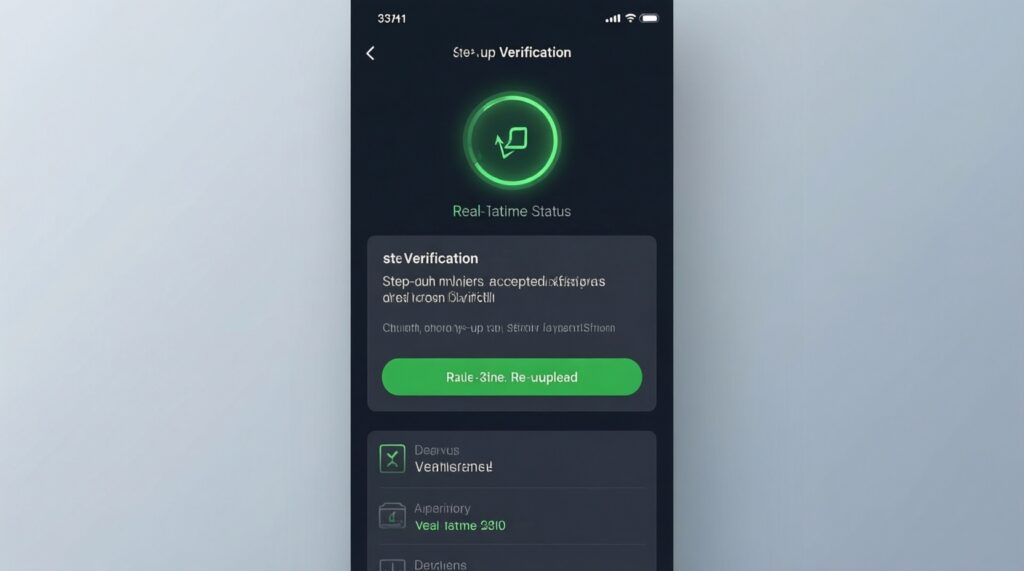
Explain the reason, accepted documents, and current status at all times, then stage verification with step-up rules and limits. Provide re-upload guidance that is specific and actionable.
Why does gameplay feel laggy only on certain Android devices?
It's often memory pressure, heavy animations, or oversized assets on mid/low tiers. Profile on real devices, reduce animation cost, and implement degraded modes for constrained hardware.
What's the safest way to add biometrics without locking users out?
Use OS-native prompts and always provide a secure fallback (PIN/device credential). Handle "not enrolled" and "temporarily locked" states with clear remediation steps.
How do we prevent trust erosion after a failed payment?
Show the failure reason in plain language and give one recommended next step (try another method, contact bank, verify identity). Keep a visible transaction record so users don't feel money disappeared.